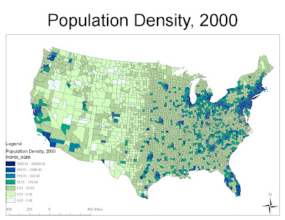
This week we analyzed census data from 2000. We first started with the raw data provided by the government and mapped out the difference in the number of people from 1990 to 2000, the total number of people in 2000, the population change by percent from 1990 to 2000, and the population density in 2000. Just by looking at the maps, we can see why they are useful. Looking at the difference in population changes, we see that the Midwest saw a big drop in population, while the key cities like Los Angeles and Sacramento saw a huge jump, just to name a few. If we then look at the percentage change map, we can see that those cities saw about a 20% growth, while cities in Nevada and New Mexico saw a growth of upwards of 50%. Looking closer at the percentage change, we can also see that some portions of the Midwest, especially the colder climates lost a minimum of 10%. Looking at the number of people map for 2000, we can see that most of the country’s population is located on either the West or East Coast. This is where the large cities are, and looking at the population density map, we can see that this is indeed true. By just performing these simple analyses, we can see these simple correlations. That is what makes maps so useful.
Looking at the Black Alone Population Census Data, we can easily see the breakdown of where the African Americans are located. Most of them currently reside in the Deep South, as that is where many of them were originally located. We do see that there are some located in other parts of the country, but from the map, it looks like no more than 10% ever leave the Deep South in any single county. Looking at the South, we do see that it is not unusual to see upwards of 25%, even 50% in many parts. This data could be looked at and be used to see where a minority president, such as President Obama, might see a surge of support from.
Taking a look at the Asian Alone population map, we can see that many are located on the West Coast with some along the north Eastern Seaboard. This could easily be explained by the fact that many come across the Pacific Ocean and tend to stay where they land. We see that in the center of the United States, there is almost no percentage of Asians, as this is a longer journey. Looking into our history books, we can notice that many Chinese men came by boat, and worked building California’s intensive railroad networks. Once they were built, many decided to stay. Noting that they came by boat, as this was a cheaper form of transportation, and while the railroads were built, airplanes were a very new thing, we can explain just why there are so few currently located in the Mid United States.
Again, we look at the minorities in the United States and can see that many of those counties lay in states that border Mexico. There is a pretty obvious explanation, in that many minorities come from Mexico. Many Mexican’s crossed the border to seek better lives, but as we have seen from our other analyses, many people do not move once they are settled in. Now that border regulations have gotten stricter, many immigrants are traveling to Mexico and crossing, as Mexican regulations are no where near as strict as the United States are. These results are not against what we expected to find, and can be used to help decided whether or not it would be a good idea to cater to a certain race in certain areas of the country. For example, it would probably be a bad idea to put a Mexican restaurant it North Dakota, but would probably be a good idea to put one in Texas.
By simply obtaining the data from the government and plotting it using GIS, we can draw many of these conclusions. These conclusions can help make decisions that might require further insight than just saying that we are going to tear this down or build this here. GIS is a marvelous tool, but must be carefully used as the tool is only as good as its user. There are many biased maps made to drive a certain point across. Many distinctions must be made, but this software helps draw conclusions to data. What used to take weeks can now be done in minutes. This software has so much potential. It can be used to see how herds migrate, to map how race distributions are changing all over the country, to who knows what. GIS is the future.


